Case 13 / 19
Everyrate
A complex decision made to feel like a simple one.
- Sector
- Fintech · Mortgages
- Year
- 2023
- Scope
- Website · Brand · Product
- Design
- Gev Marotz

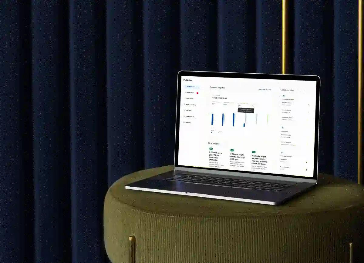
Anyone shopping for a mortgage ends up building the same spreadsheet. Lenders down one side, rates across the top, and a growing suspicion that the numbers do not line up. Everyrate wanted to be the page that replaces it. Every competitor claims the same thing, and they all look alike doing it.
A category that all looks the same
The comparison engine is the easy half. Mortgage sites have settled on one look: blue, reassuring, interchangeable. A new one arrives already resembling the four tabs the user just closed. There was also no name yet.
Start with the name, then refuse the blue
The name came first. Everyrate says the whole offer in one word, which is the cheapest advantage a brand like this can get.
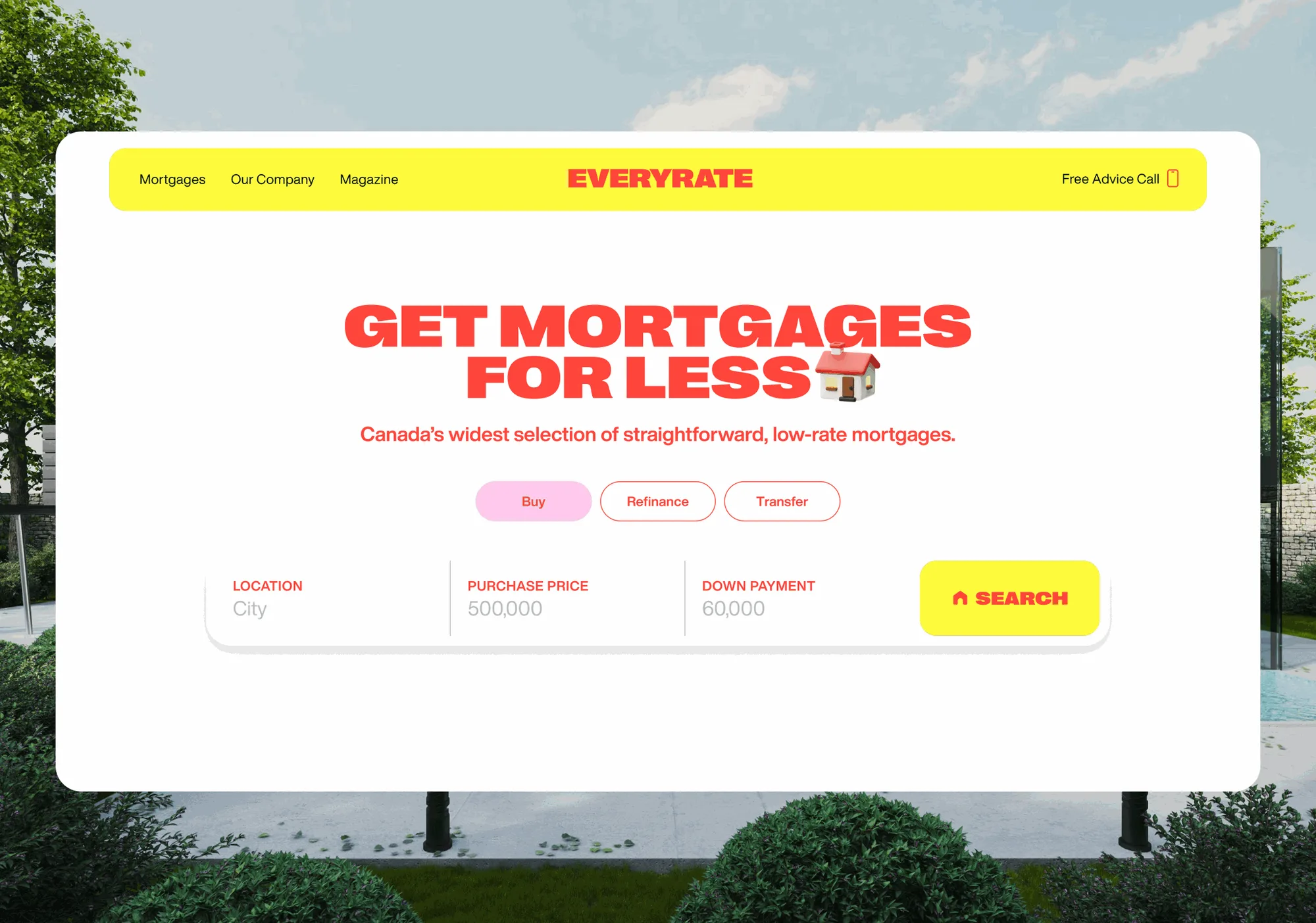
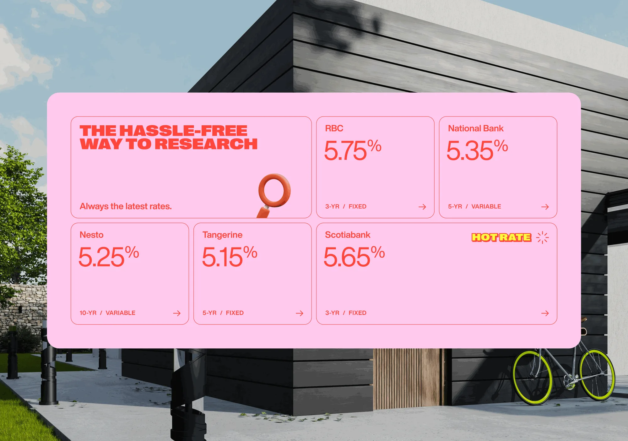
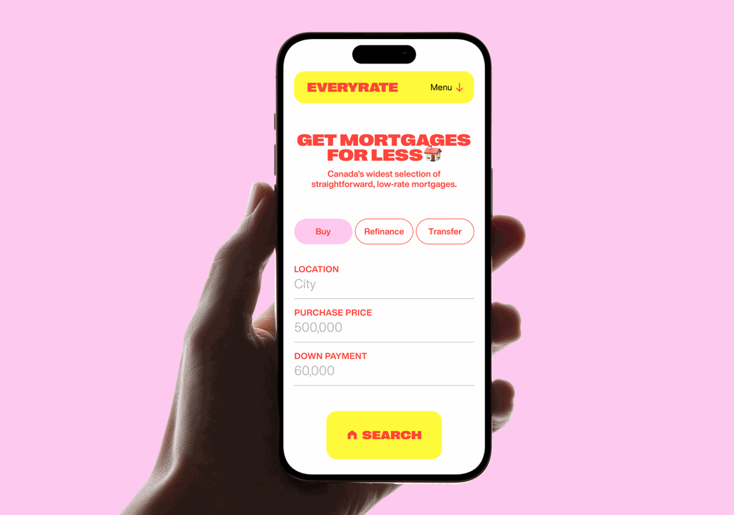
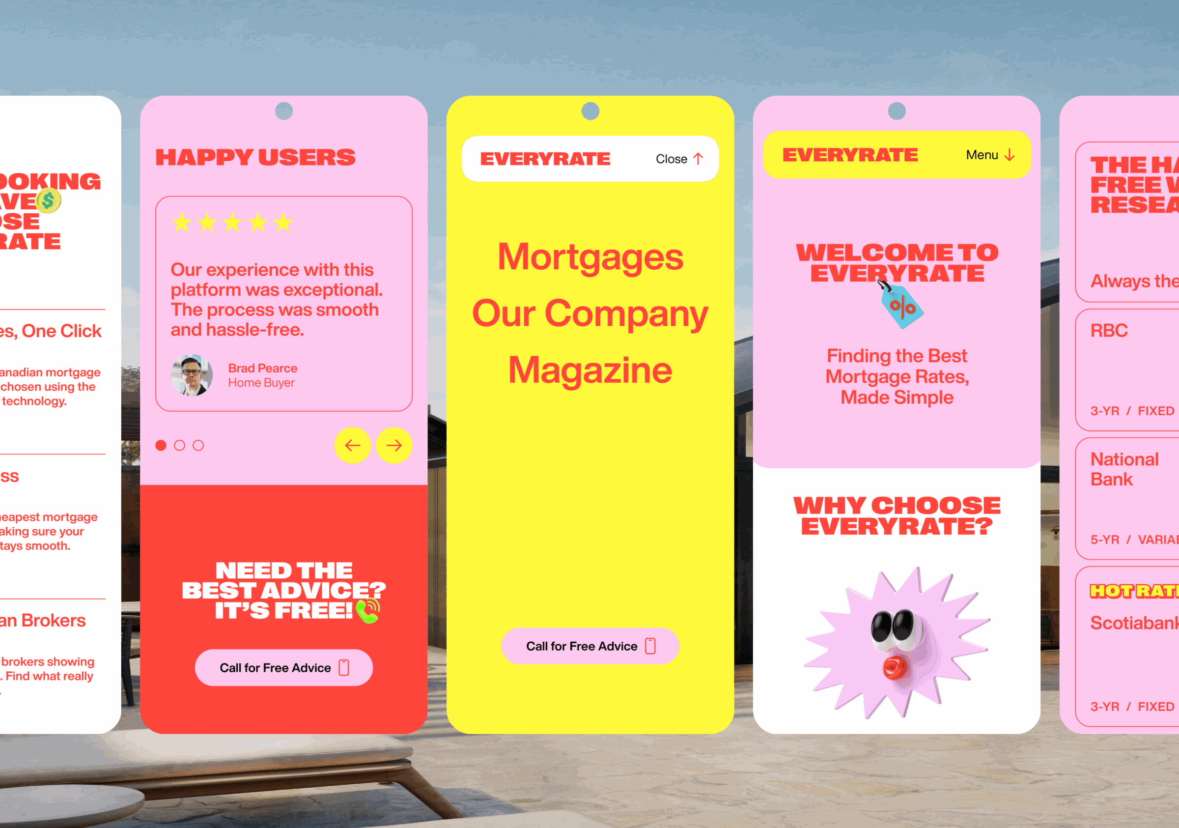
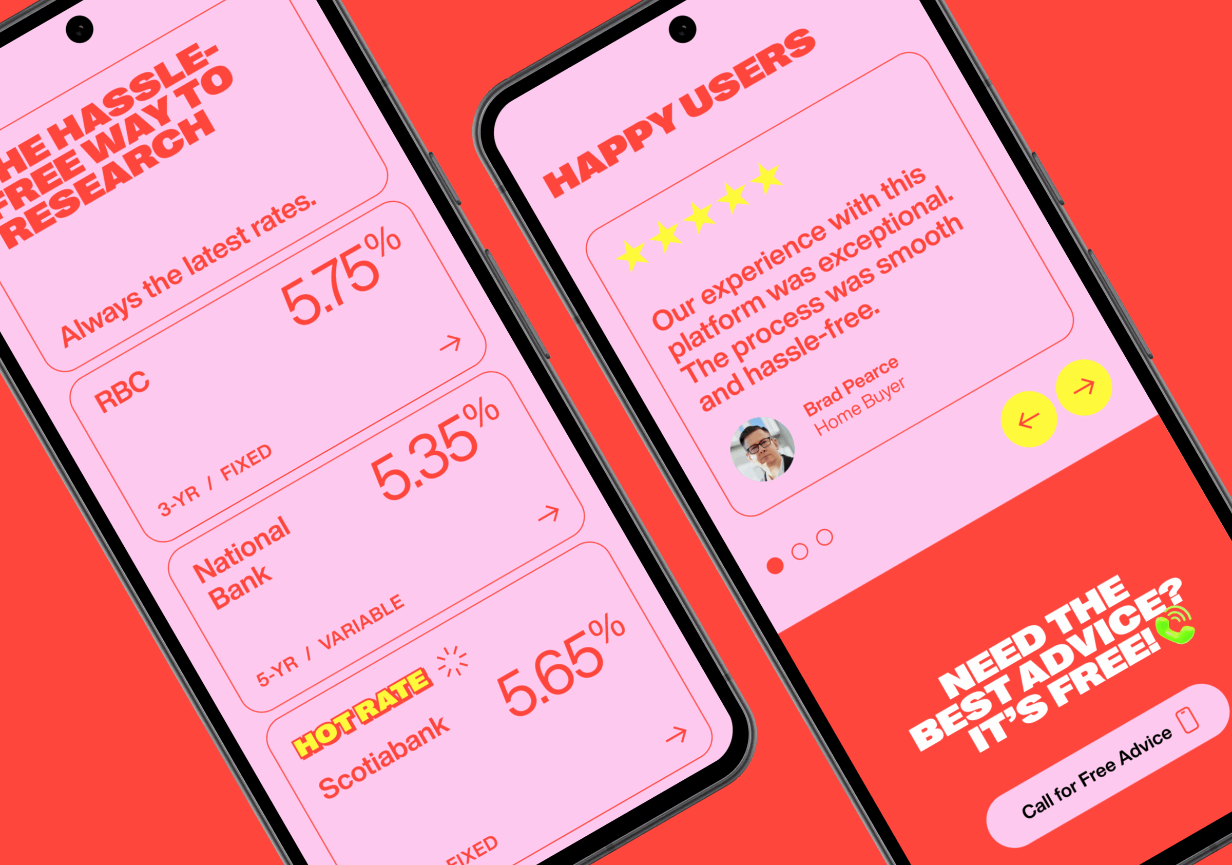
Then the palette broke with the category. Yellow on coral is not what a mortgage site looks like. That is the point. On a page full of blue, being the one that is not blue beats having a better gradient.
Underneath, the platform was built to make one hard decision feel short.
Gev Design was awesome to work with. They brought our vision to life with a standout brand, website, and platform. Their expertise truly sets Everyrate apart.
Live, and hard to mistake for the others
Everyrate is live at everyrate.com, with a name, an identity and a comparison product that did not exist before the project. It is the yellow one.